
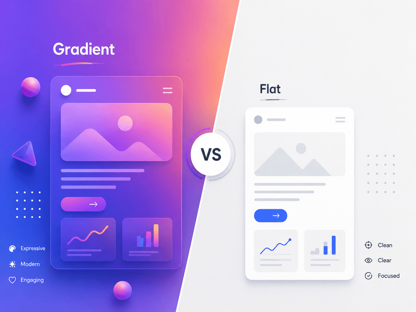
One of the most deceptively simple decisions in interface design is also one of the most consequential: what goes behind your content. Should the background be a clean, single flat color, or a rich, multi-tonal gradient? It looks like a purely aesthetic choice, but it quietly shapes brand perception, visual hierarchy, accessibility, performance, and even how 'premium' or 'trustworthy' a product feels within the first few seconds of loading. Over the last decade, UI design has swung between these two philosophies more than once. Flat design dominated the 2013-2018 era as a reaction to the glossy, over-textured skeuomorphism that came before it. Then gradients quietly crept back in through fintech apps, AI product landing pages, and Web3 branding, evolving into what many now call 'soft gradients' or 'mesh gradients.' For designers, product owners, and startup founders, understanding the strategic difference between gradient and flat backgrounds is essential to building an interface that not only looks current but also performs well and communicates the right brand story. This guide breaks down both approaches in depth—covering psychology, technical performance, accessibility, brand alignment, and a practical decision framework—so you can make an informed choice rather than a purely trend-driven one.
1. What Is Flat Background Design?
- Definition & Core Principles - Flat design uses solid, single-tone colors with no gradients, shadows, textures, or 3D effects. Backgrounds are typically one uniform hue or a simple two-tone block, relying on typography, spacing, and color contrast—rather than depth cues—to create visual interest.
- Why It Became Popular - Flat design rose to dominance because it rendered faster on early mobile devices, scaled cleanly across resolutions and screen densities, and aligned with the minimalist design language popularized by major operating systems in the mid-2010s.
- Where It Excels Today - Flat backgrounds remain the default choice for content-dense products—dashboards, admin panels, documentation tools, and enterprise SaaS—where the background must stay out of the way and let data, tables, and text take center stage.
2. What Is Gradient Background Design?
- Definition & Core Principles - Gradient backgrounds blend two or more colors smoothly across a surface, creating a sense of depth, light, and movement. Modern gradients range from subtle two-tone linear blends to complex 'mesh gradients' with multiple soft, organic color pools.
- The Comeback Story - Gradients faded during the flat-design era but resurfaced strongly through fintech, AI, and consumer tech branding, where soft, glowing color blends helped differentiate products in an increasingly flat, look-alike marketplace.
- Where It Excels Today - Gradients thrive on marketing pages, hero sections, onboarding flows, app icons, and brand moments—anywhere the goal is emotional impact, perceived innovation, or a distinctive first impression rather than dense information display.
3. Visual Hierarchy: How Each Approach Guides the User's Eye
- Flat Backgrounds & Predictable Hierarchy - Because flat backgrounds carry no inherent visual weight, hierarchy is created entirely through typography scale, spacing, and contrasting accent colors. This makes flat interfaces highly predictable and easy to scan, which is ideal for data-heavy or task-focused products.
- Gradient Backgrounds & Directional Attention - Gradients naturally create a light-to-dark or warm-to-cool flow that can subtly direct the eye toward a focal point, such as a CTA button or hero headline, without adding extra visual elements. Poorly placed gradients, however, can just as easily pull attention away from key content.
- The Contrast Trade-off - Flat backgrounds make it easier to guarantee consistent text contrast across an entire surface. Gradients require careful contrast testing at every point where text or icons overlap the gradient, since contrast ratios shift as the color blend changes.
4. Brand Personality & Emotional Impact
- Flat: Trust Through Simplicity - Flat backgrounds communicate clarity, efficiency, and no-nonsense reliability. They are strongly associated with productivity tools, fintech dashboards, and enterprise software where users value speed and predictability over visual flair.
- Gradient: Energy Through Depth - Gradients evoke warmth, optimism, innovation, and premium positioning. They are frequently chosen by AI products, creative tools, and consumer apps that want to feel imaginative, futuristic, or emotionally engaging rather than purely utilitarian.
- Matching Background to Brand Voice - A serious B2B compliance tool leaning on heavy gradients can feel inconsistent with its promise of stability, just as a playful consumer wellness app built entirely on flat gray backgrounds may feel cold and uninviting. Background style should reinforce brand voice, not contradict it.
5. Performance, Accessibility & Technical Considerations
- Rendering & Load Performance - Flat colors are computationally cheap—a single hex value paints instantly with zero rendering overhead. Gradients, especially large mesh or animated gradients, require more GPU and CPU work and can introduce jank on low-end devices if not optimized with modern CSS gradient techniques.
- Accessibility & Contrast Compliance - WCAG contrast requirements apply regardless of background style. Flat backgrounds make it straightforward to hit a consistent 4.5:1 contrast ratio for text. Gradients demand contrast testing at the lightest and darkest points of the blend, plus extra caution for users with low vision or color vision deficiencies.
- Dark Mode & Theme Consistency - Flat backgrounds translate cleanly between light and dark themes with a simple color swap. Gradients need a separate, carefully tuned gradient definition for dark mode, since a gradient that looks premium in light mode can look muddy or harsh when inverted.
6. A Practical Decision Framework: Which Should You Choose?
- Choose Flat When - Your product is data-dense (dashboards, admin tools, spreadsheets), your users perform repetitive tasks daily, your team has limited design or engineering bandwidth, or your brand identity centers on clarity, trust, and efficiency.
- Choose Gradient When - You are building a marketing site, landing page, or onboarding flow meant to create an emotional first impression, your brand wants to signal innovation or premium positioning, or you are designing a consumer-facing app where delight and differentiation matter more than raw information density.
- The Startup Founder's Litmus Test - Ask what your background needs to do: hold attention for three seconds on a landing page, or disappear for hours behind a busy dashboard. Backgrounds that must disappear should stay flat; backgrounds that must sell a feeling can afford a gradient.
7. The Hybrid Approach: Best of Both Worlds
- Zone-Based Application - Many successful modern products use flat backgrounds for core application screens and reserve gradients for high-impact zones—hero banners, empty states, upgrade prompts, and onboarding—so gradients feel special rather than exhausting.
- Subtle Gradient Overlays - Instead of a full-saturation gradient, designers increasingly use near-flat backgrounds with a very subtle gradient overlay (a 5-10% shift in lightness) that reads as flat at a glance but adds depth and warmth on closer inspection.
- Consistency Through Design Tokens - Whichever approach you choose, define it as a reusable design token—background.base, background.hero, background.gradientPrimary—so the decision is applied consistently across the product rather than improvised screen by screen.
Conclusion
Neither flat nor gradient backgrounds are objectively 'better'—they are different tools solving different problems. Flat design optimizes for clarity, performance, and long-session usability, making it the safer default for dense, functional products. Gradient design optimizes for emotional impact, brand differentiation, and first-impression moments, making it the stronger choice for marketing surfaces and consumer delight. The most effective products in 2026 rarely pick one dogma and apply it everywhere. Instead, they treat background style as a strategic decision tied to context: flat where users need to focus and work, gradient where the brand needs to breathe and connect emotionally. Define that intent clearly, codify it into your design system, and your background choice will stop being a stylistic guess and start being a deliberate part of your product strategy.